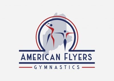
Logo Design: American Flyers Gymnastics Delivering elegance and strength.
The American Flyers Gymnastics Team, which trains at the Maine Academy of Gymnastics, needed a logo refresh. After a few preliminary rounds of concepts, we settled on a traditional athletic design with a typeface that has a retro feel. I created several versions to accommodate the myriad scenarios where the logo might appear.
Primary Logo
The American Flyers Gymnastics Team, which trains at the Maine Academy of Gymnastics, needed a logo refresh.. After a few preliminary rounds of concepts, we settled on a traditional athletic design with a typeface that has a retro feel. Maine is clearly represented by the state outline. The abstract athletes in the center convey an elegance and strength that’s reflective of the sport of gymnastics.
Alternate Logos
Frequently the women’s and men’s team compete at separate events, so we decided to develop separate logos for each team. In addition, the women host an invitational gymnastics meet every year which needed its own version to apply to apparel that would be distributed at the event.


